LIVE

Data Studio,
but finally beautiful.

A premium library of 75+ Data Studio visualizations. One subscription. Every chart your team will ever need. Easy to add.

14-day free trial No credit card Cancel anytime
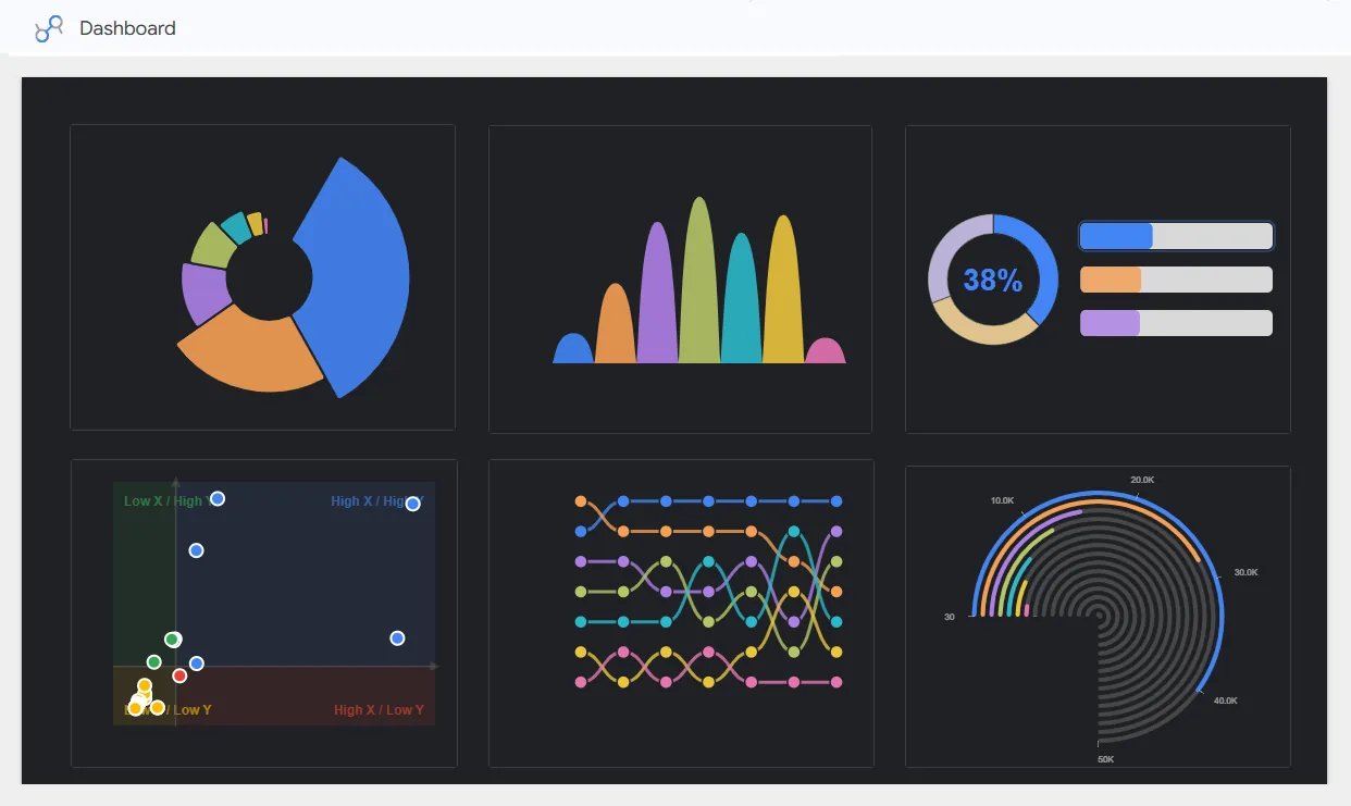
vizstudio dashboard (dark)
vizstudio dashboard (light)

Five charts your dashboards can't live without.

The charts Data Studio left out, now first-class components. Five shipped this quarter, each one answering a question your dashboard couldn't.

Real screenshots Live in production Easy install
01 Comparison

The chart that ends the prioritization meeting.

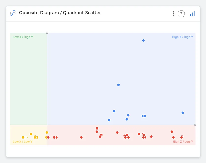
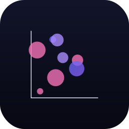
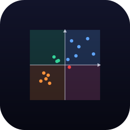
Stop arguing in a spreadsheet. Plot two metrics (say, traffic vs. conversion) and let the four labeled regions do the talking. The High/High quadrant lights up your winners. The Low/Low corner names the work to drop.

Four labeled quadrants Cross-filter on click Quadrant labels
Open 2x2 Matrix

Quadrant Scatter: points sorted across four labeled regions
02 Geography · 3D

Show the world like a globe, not a misshapen rectangle.

Real Natural Earth country polygons on a true orthographic sphere: atmosphere glow, graticule grid, tooltips and country labels included. Drag to rotate, scroll to zoom, click any country to cross-filter the page.

ISO-3 / ISO-2 / name / numeric Drag · auto-spin · zoom Click to cross-filter Natural Earth 110m
Open Interactive 3D Globe
Interactive 3D Globe
03 Geography

A map your CMO will actually read.

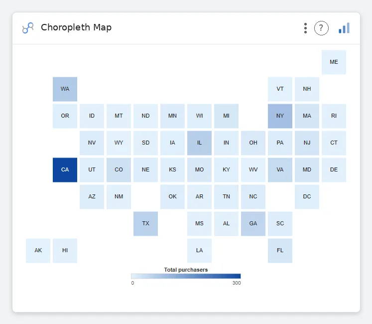
No tile loads. No zoom dance. Every state gets equal screen real estate: Wyoming reads as loud as California, and the regional story surfaces in milliseconds. Pass state abbreviations, get a colored grid back.

US states or ISO countries Sequential / diverging Click to filter ~30s setup
Open Choropleth Map
Choropleth Map: U.S. tile grid colored by total purchasers
04 Distribution & density

Forty thousand points. One readable chart.

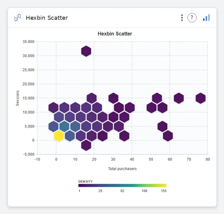
When a scatter plot becomes an overplotted blob, hex bins encode density on a viridis ramp so the hot zones surface immediately. Outliers stay visible. The shape of your data finally has a shape.
2 metrics Density color ramp Adjustable bin size 50k+ rows
Open Hexbin Scatter
Hexbin Scatter: density-binned hexagons of total purchasers vs sessions
05 Time series & context

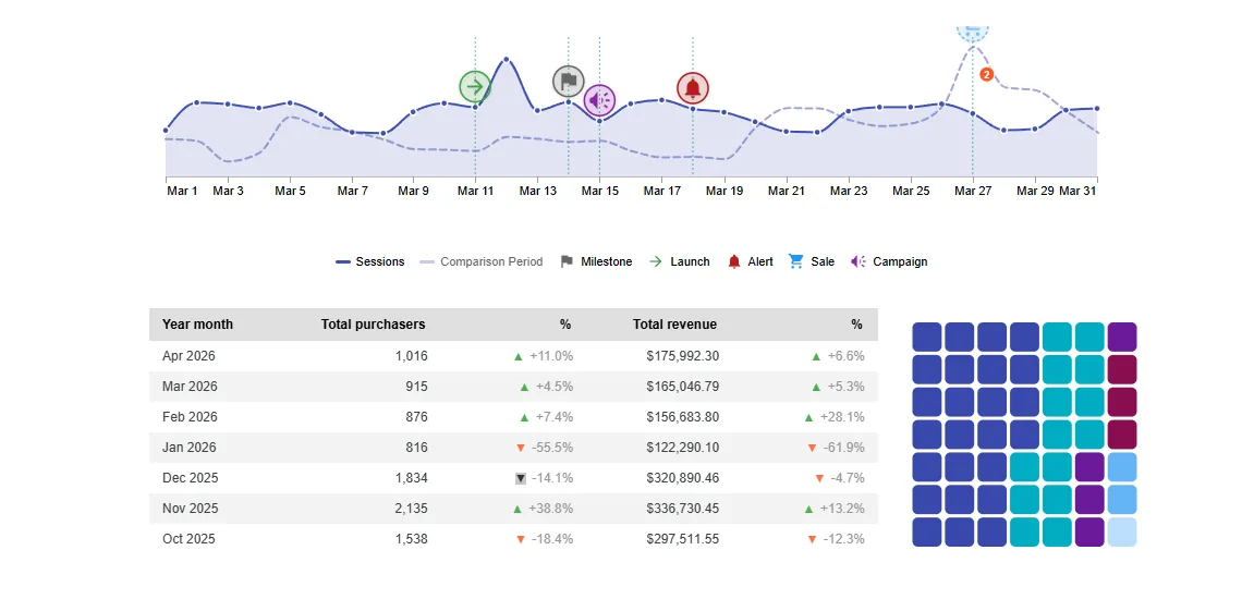
Every spike has a story. Pin it to the line.

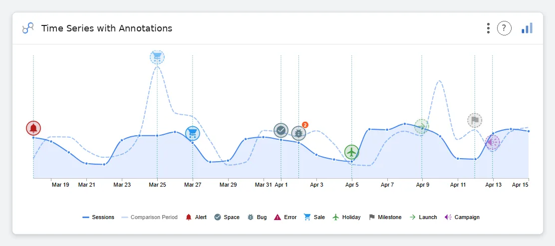
A line chart only shows what happened. Drop typed markers (launches, campaigns, sales, bugs, holidays) right on the date and it shows why. The Apr 9th jump stops being a mystery and starts being "the launch."

1 date · 1+ metrics 9 marker types Comparison period Stacked same-day pins
Open Time Series with Annotations
Time Series with Annotations: Sessions line with comparison period and typed event markers across Mar 19 to Apr 15

That's five. There are seventy more like them.

Explore the full chart library

Spotted in a Data Studio near you.

Our charts end up in board decks, investor updates, and exec reviews. Here's a real Data Studio report assembled entirely from vizstudio components.

A Data Studio dashboard rendered with vizstudio charts: exploded donut, waffle grid, and dial gauge.
Exploded donutcustomer segments
Waffle 10×6NPS distribution
Dial gaugequota attainment
Demo revenue dashboard: every element is a vizstudio community visualization.

75+ charts. Every one designed and ready to drop in.

Tap any tile to preview it live. Filter by type to jump straight to what you need.

Open full gallery → Suggest a chart →

From subscription to shipped dashboard in 90 seconds.

01

Subscribe

Pick a plan. Paste your workspace email. We provision instantly.

02

Add

Open any Data Studio report, browse the library, click Get Started.

03

Visualize

Point the chart at your data. We handle rendering, filtering, cross-linking.

Simple pricing. Full library.

Every tier unlocks the entire chart library, no feature gating, no per-seat upcharges, no surprise metering.

Monthly
$75 $50 / month
Pay as you go. Full library access. Cancel anytime.
  • Full chart library · 75+ types
  • Unlimited reports & viewers
  • Custom branding
  • Email support
Custom
Let's talk
Enterprise features, SSO, dedicated infra, custom chart builds.
  • Everything in Annual
  • SSO · SAML · SCIM
  • Dedicated CSM
  • Custom chart builds

Built to disappear into your report.

Native look, custom power

Every chart reads your report theme (fonts, series colors, background), so a vizstudio component sits next to a stock scorecard without a seam.

Cross-filtering built in

Click a slice, a state, a node and the rest of your report filters with it. Our charts are report citizens, not embedded pictures.

No iframes, no third-party calls

Each visualization is three self-contained files served through Google's own community-viz pipeline. Nothing phones home.

Questions we get a lot.

Do I need a developer to set this up?
No. Setup happens inside Data Studio, an easy add from our gallery. Styling and theming are point-and-click in the chart’s Style panel.
What happens to my charts if I cancel?
Your charts keep working through the end of your subscription. After that, simply swap them for Data Studio's default charts. Your data and queries stay right where they are.
Can I use my own colors and fonts?
Yes. You can set custom colors on every chart, and most charts pick up your report's theme colors automatically for fast setup.
How often do you add new charts?
We're always building. The library keeps growing with new charts and improvements, and every customer gets every new chart, no tiers.
Do you offer a free trial?
Yes: a 14-day free trial with the full library, no credit card. Sign up and you're in immediately. After the trial, pick Monthly or Annual.
Is my data sent to vizstudio servers?
No. Rendering happens inside Data Studio's sandbox. No data from your reports is ever accessed or collected by us.

Ship reports your team actually reads.

Start your 14-day free trial: no credit card, no commitment. Your execs will notice within the first week.