
Beeswarm / Swarm Plot
Every individual point, no overlap: distributions that boxplots hide.
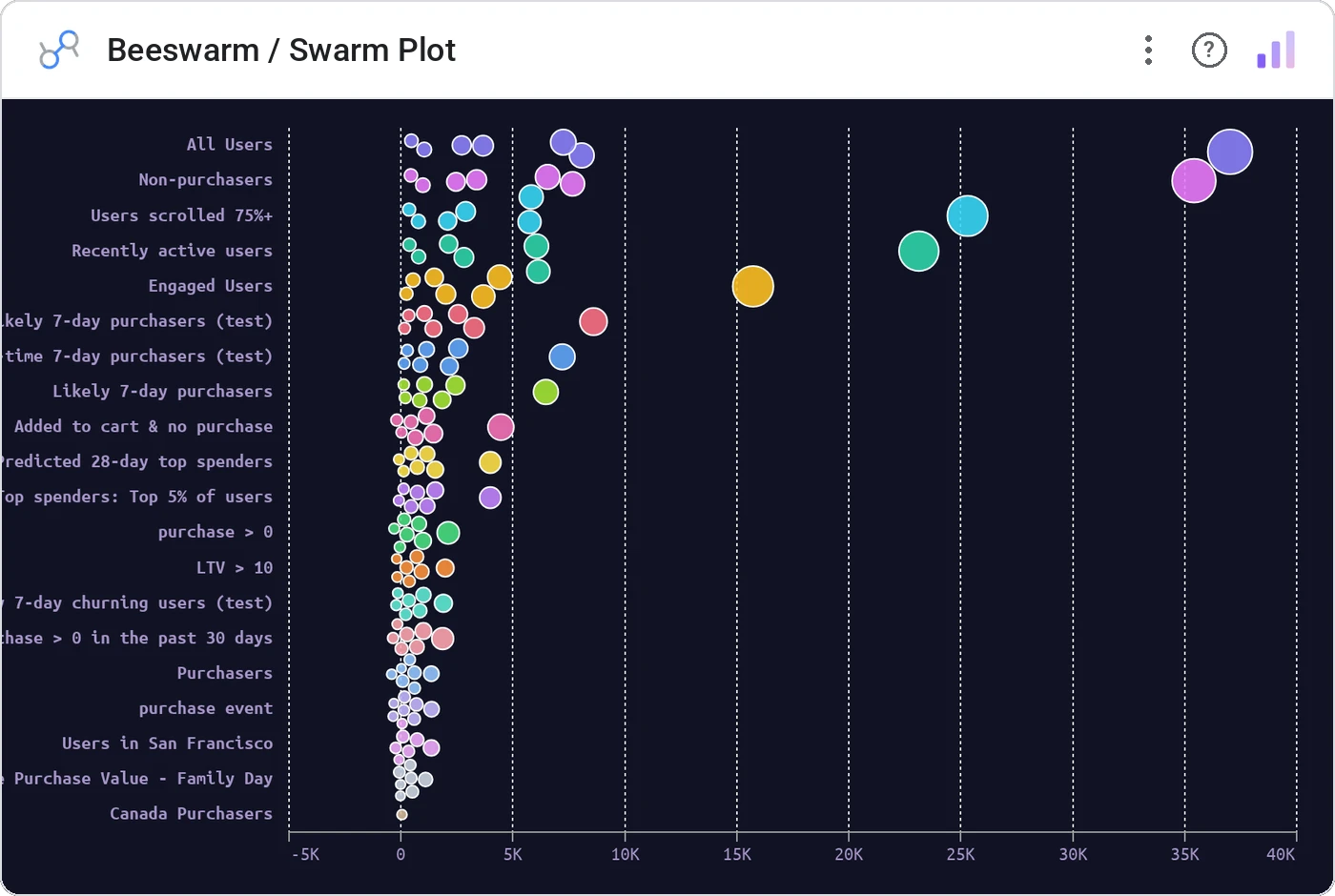
Beeswarm plots every record as a circle along one axis, using force collision so points sit next to each other instead of stacking. You see the true shape of the distribution, the gaps, the clumps, the long tail.
Force-positions individual data points along an axis with collision detection. Optional grouping by dimension and sizing by a second metric.
Box plots and violins smooth away the story. Beeswarm shows every customer, every deal, every order: including the ones you’ll want to investigate.
Three ways teams use it.
Deal size by rep: see whose pipeline is bimodal.
Compensation by level with each employee as a dot.
Delivery time per route with outliers visible.
Add it in 30 seconds.
Open your Data Studio report and click Add a chart → Community visualizations → Explore more.
Paste the Viz Studio manifest URL or pick this chart from the Viz Studio gallery card.
Bind the dimensions and metrics in the data panel. Done.

Included in your vizstudio plan.
One plan, everything in it: the full library of 75+ charts. No per-seat upcharges, no metering. Build a real dashboard before you pay a cent.
Start free →