
Word Cloud
Word cloud: frequency-weighted, color-coded, optional category grouping.
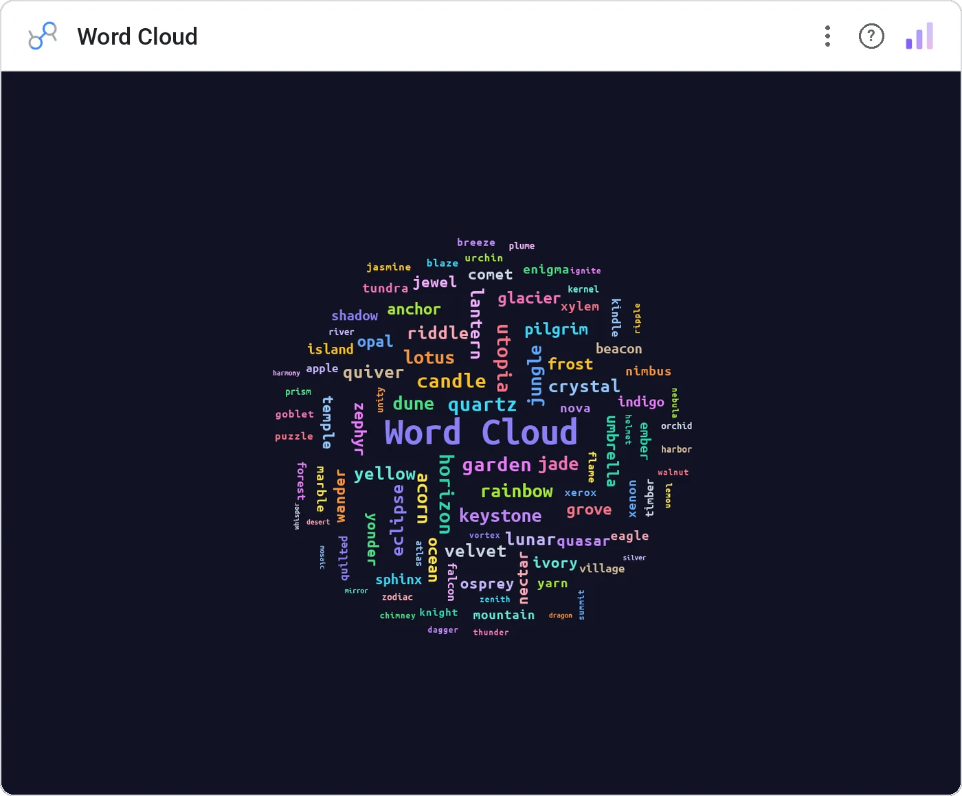
Word Cloud renders terms sized by frequency, optionally colored by category, with click-to-cross-filter. The fastest way to summarize unstructured text, and the chart your CMO actually asks for.
Frequency-weighted word layout with optional color-by-category and cross-filter on click.
Sometimes the question is "what are people talking about?", and the word cloud is the right answer, no apology.
Three ways teams use it.
Top ticket terms across a quarter.
Open-ended response themes.
Top brand mentions in the news.
Add it in 30 seconds.
Open your Data Studio report and click Add a chart → Community visualizations → Explore more.
Paste the Viz Studio manifest URL or pick this chart from the Viz Studio gallery card.
Bind the dimensions and metrics in the data panel. Done.
More from Tables, Calendars & Combo
All 75+ charts →
Full calendar grid: event volume painted across every cell.

Compact monthly calendar: one cell, one number, instant pattern.
Day-of-week × hour heatmap: when your audience actually shows up.

Row over row: DoD / MoM / YoY comparison table with deltas and % change.
Included in your vizstudio plan.
One plan, everything in it: the full library of 75+ charts. No per-seat upcharges, no metering. Build a real dashboard before you pay a cent.
Start free →