
Waffle Chart
10×10 grid (every square is 1%), the part-to-whole everyone reads correctly.
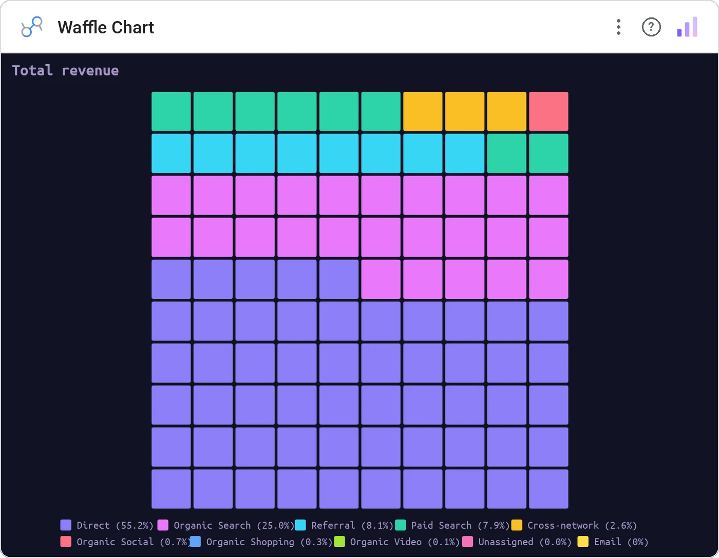
Waffle Chart turns part-to-whole into a 100-square grid where each square represents 1% of the total, colored by category. Easier to read percentages from than a pie, and looks fantastic.
10x10 grid where each square = 1%, filled by category with configurable fill direction, tooltip, cross-filter.
Pies fail at small slices; waffle charts show every percentage point.
Three ways teams use it.
Population breakdown.
Audience share by segment.
Revenue mix at 1% granularity.
Add it in 30 seconds.
Open your Data Studio report and click Add a chart → Community visualizations → Explore more.
Paste the Viz Studio manifest URL or pick this chart from the Viz Studio gallery card.
Bind the dimensions and metrics in the data panel. Done.
More from Pies, Donuts & Part-to-Whole
All 75+ charts →
Two donuts side-by-side: current vs prior, plan vs actual, the comparison view.

Nested donut rings: multiple metrics, same center, one composition.

Variable-radius nested donut: two metrics per slice, one chart.

Variable-radius pie: angle is share, radius is a second metric.
Included in your vizstudio plan.
One plan, everything in it: the full library of 75+ charts. No per-seat upcharges, no metering. Build a real dashboard before you pay a cent.
Start free →