
Bubble Grid
A grid of bubbles: counts and magnitudes across two categorical axes.
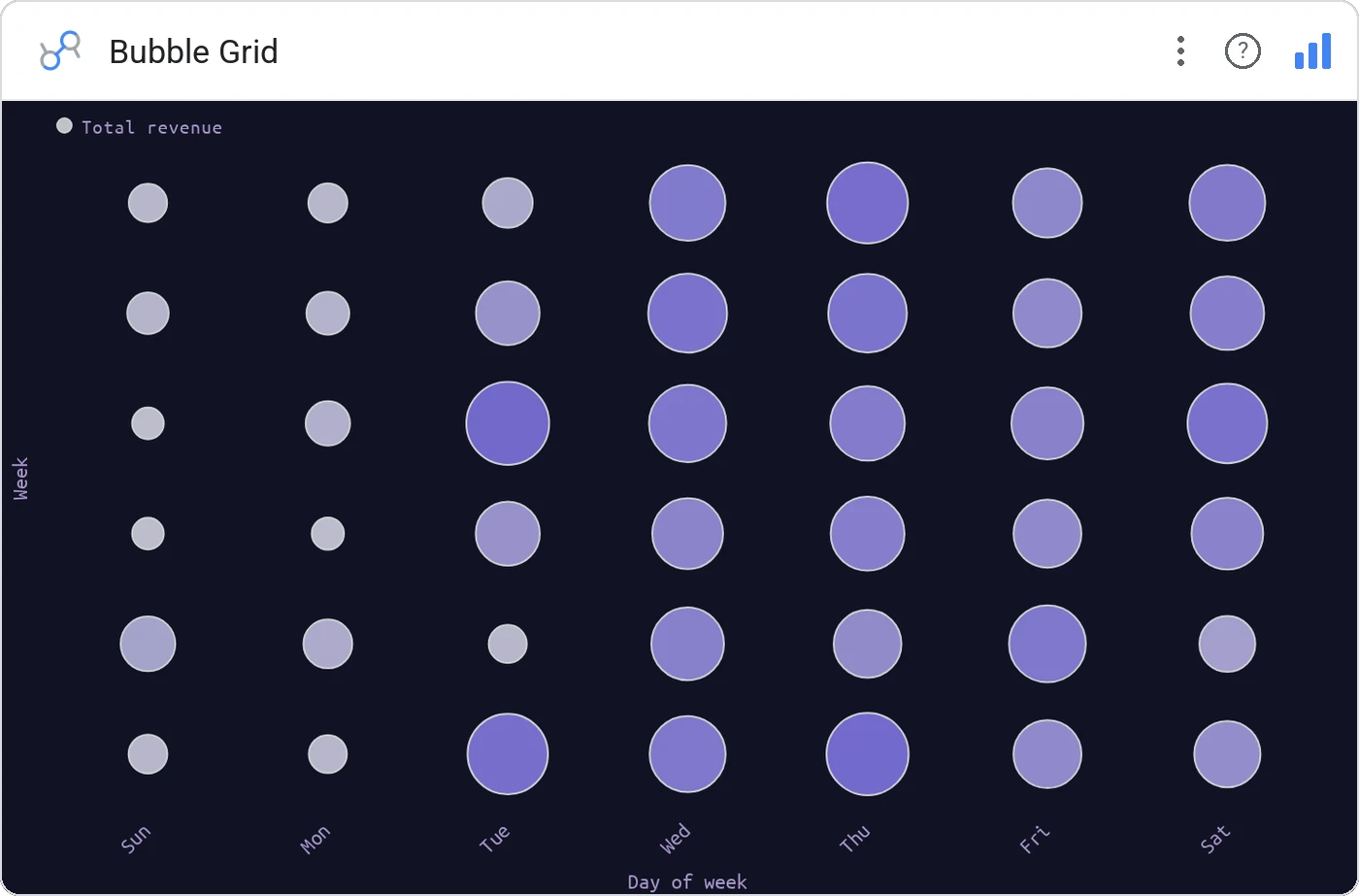
Bubble Grid arranges sized circles on a discrete row × column grid, perfect when both axes are categorical (region × product, stage × source). It’s a heatmap that uses area instead of opacity, and it always looks deliberate.
Rows × columns of bubbles, area-sized by the metric, optional color encoding for a secondary metric.
Reads denser than a heatmap when the value range is wide, the eye can compare areas across the grid even when small.
Three ways teams use it.
Activations by plan × geography.
Sales by category × store format.
Ticket volume by issue × priority.
Add it in 30 seconds.
Open your Data Studio report and click Add a chart → Community visualizations → Explore more.
Paste the Viz Studio manifest URL or pick this chart from the Viz Studio gallery card.
Bind the dimensions and metrics in the data panel. Done.
More from Scatter, Correlation & Bubbles
All 75+ charts →
X × Y × size: three metrics, one chart, zero squinting.

Hexagonal density: scatter plots that survive 100k points.

Four-quadrant scatter, the strategy chart you've drawn on whiteboards.
Scatter with a fitted trend line: correlation without the chart-junk.
Included in your vizstudio plan.
One plan, everything in it: the full library of 75+ charts. No per-seat upcharges, no metering. Build a real dashboard before you pay a cent.
Start free →