
Bubble Chart
X × Y × size: three metrics, one chart, zero squinting.
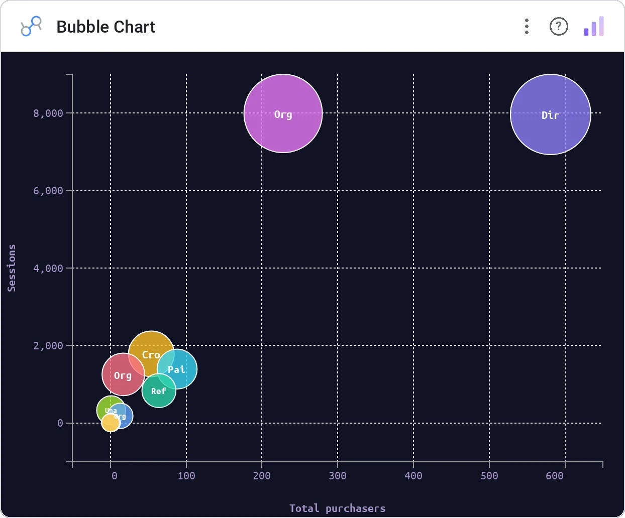
Bubble Chart encodes a third metric as circle size on top of a standard scatter, with optional category color. It’s the workhorse for any "big and growing" / "small and shrinking" story.
Renders circles sized by a third metric on x/y axes, with optional category coloring, hover tooltip, and click-to-filter.
Adds a magnitude dimension without forcing a second chart. The eye reads area and position simultaneously.
Three ways teams use it.
Markets by revenue × growth × size (the BCG-matrix you actually deploy).
Accounts by deal count × ACV × pipeline.
Features by usage × satisfaction × engineering cost.
Add it in 30 seconds.
Open your Data Studio report and click Add a chart → Community visualizations → Explore more.
Paste the Viz Studio manifest URL or pick this chart from the Viz Studio gallery card.
Bind the dimensions and metrics in the data panel. Done.
More from Scatter, Correlation & Bubbles
All 75+ charts →
A grid of bubbles: counts and magnitudes across two categorical axes.

Hexagonal density: scatter plots that survive 100k points.
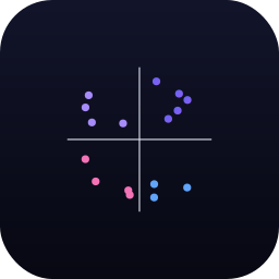
Four-quadrant scatter, the strategy chart you've drawn on whiteboards.
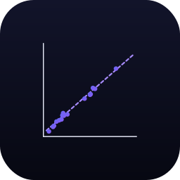
Scatter with a fitted trend line: correlation without the chart-junk.
Included in your vizstudio plan.
One plan, everything in it: the full library of 75+ charts. No per-seat upcharges, no metering. Build a real dashboard before you pay a cent.
Start free →