
Sunburst Chart
Radial hierarchy: concentric rings drill into your structure.
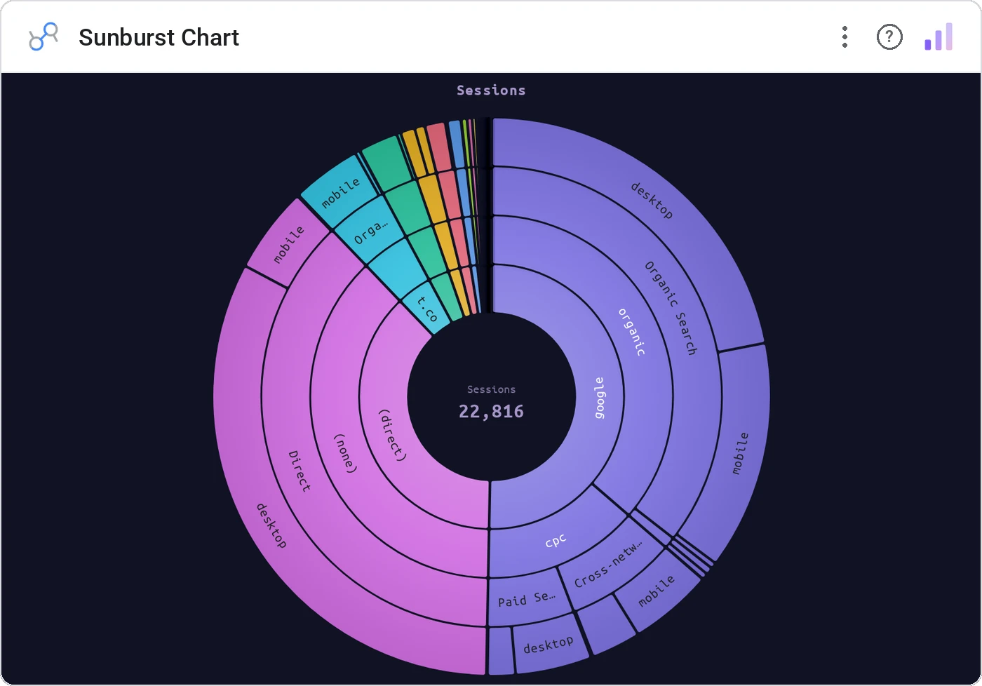
Sunburst Chart renders nested dimensions as concentric arcs sized by a metric. Up to 5 levels, three color modes (By Depth / By Category / Single), configurable inner radius, smart auto-rotated labels with truncation + min-size culling, breadcrumb tooltip with %-of-total, and cross-filter on click.
Up to 5 nested dimensions as concentric arcs. Color modes (By Depth / By Category / Single), inner radius config, label truncation + min-size cull, breadcrumb tooltip, click cross-filter through ancestors.
Treemaps are great; sunbursts are great when the hierarchy itself is the protagonist.
Three ways teams use it.
Sector → industry → company.
Region → country → city → store.
Service → endpoint → status.
Add it in 30 seconds.
Open your Data Studio report and click Add a chart → Community visualizations → Explore more.
Paste the Viz Studio manifest URL or pick this chart from the Viz Studio gallery card.
Bind the dimensions and metrics in the data panel. Done.
More from Hierarchies & Drilldown
All 75+ charts →

Included in your vizstudio plan.
One plan, everything in it: the full library of 75+ charts. No per-seat upcharges, no metering. Build a real dashboard before you pay a cent.
Start free →