
Pareto Chart
Bars + cumulative line, the 80/20 rule, made obvious.
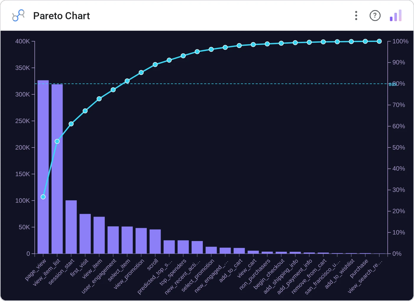
Pareto Chart sorts categories descending by value and overlays a cumulative percentage line: exactly the chart Joseph Juran intended for prioritization. The 80% cutoff is rendered automatically.
Descending sorted bars with a cumulative % line, optional 80% reference line, tooltip, and cross-filter.
Prioritization conversations end here. The handful of bars before the cumulative line crosses 80% is your roadmap.
Three ways teams use it.
Defect cause analysis: top causes covering 80% of defects.
Cost driver Pareto for procurement.
Top ticket categories.
Add it in 30 seconds.
Open your Data Studio report and click Add a chart → Community visualizations → Explore more.
Paste the Viz Studio manifest URL or pick this chart from the Viz Studio gallery card.
Bind the dimensions and metrics in the data panel. Done.
More from Bars, Columns & Ranking
All 75+ charts →
CI bars for A/B variants: significance baked in.

The animated bar chart race that wins every monthly review.

Animated curved columns: bars that arc to draw the eye.

Curved columns, static, the still-frame version with the same elegance.
Included in your vizstudio plan.
One plan, everything in it: the full library of 75+ charts. No per-seat upcharges, no metering. Build a real dashboard before you pay a cent.
Start free →