
Flow Map
Geographic flow lines: origins, destinations, and volumes on a map.
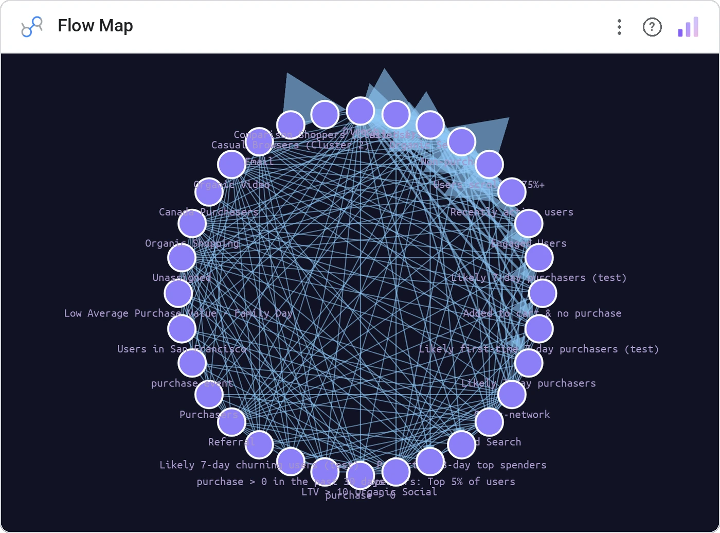
Flow Map draws origin-to-destination flows on a geographic canvas with weighted line thickness. Build a logistics chart that actually reads like a map, not a tangle of arrows.
Origin/destination pairs as bezier flows on a geographic projection, weighted by volume, with hover-highlight and tooltip.
Spreadsheet shipment data hides geography. Flow maps put it back.
Three ways teams use it.
Inbound shipments by origin country.
Cross-region campaign reach.
Top inter-city passenger flows.
Add it in 30 seconds.
Open your Data Studio report and click Add a chart → Community visualizations → Explore more.
Paste the Viz Studio manifest URL or pick this chart from the Viz Studio gallery card.
Bind the dimensions and metrics in the data panel. Done.
More from Networks, Flows & Relationships
All 75+ charts →
Node-link arc diagram: relationships you can actually trace.

Proportional circles for audience segments: overlaps you can see.

Two columns, every link explicit: A-to-B relationships made obvious.

Circular chord ribbons: every pairwise flow, perfectly weighted.
Included in your vizstudio plan.
One plan, everything in it: the full library of 75+ charts. No per-seat upcharges, no metering. Build a real dashboard before you pay a cent.
Start free →