
Row Over Row Comparison Table
Row over row: DoD / MoM / YoY comparison table with deltas and % change.
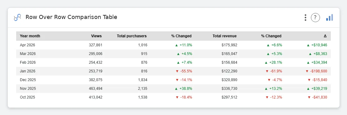
Row Over Row Comparison Table is the analyst’s love letter to themselves: a clean comparison grid with absolute deltas, % change, per-metric formatting, theme-aware coloring, and no Excel grid lines pretending to be design.
Period-over-period comparison table (DoD/MoM/YoY) with Current, Prior, Δ, and % Change columns. Theme-aware coloring, per-metric formatting, sticky headers.
Standard Data tables don’t do period comparison: this one was built for the way analysts actually talk.
Three ways teams use it.
Weekly metrics WoW: spend, leads, CPL, conversion rate.
Monthly P&L line items MoM with % change colored.
Daily DAU/WAU YoY for trend conversations.
Add it in 30 seconds.
Open your Data Studio report and click Add a chart → Community visualizations → Explore more.
Paste the Viz Studio manifest URL or pick this chart from the Viz Studio gallery card.
Bind the dimensions and metrics in the data panel. Done.
More from Tables, Calendars & Combo
All 75+ charts →
Full calendar grid: event volume painted across every cell.

Compact monthly calendar: one cell, one number, instant pattern.

Day-of-week × hour heatmap: when your audience actually shows up.

Row × column matrix: normalize how you want, color tells the story.
Included in your vizstudio plan.
One plan, everything in it: the full library of 75+ charts. No per-seat upcharges, no metering. Build a real dashboard before you pay a cent.
Start free →