
Actual Over Target Dot Chart
Actual over target dots: beats and misses, colored automatically.
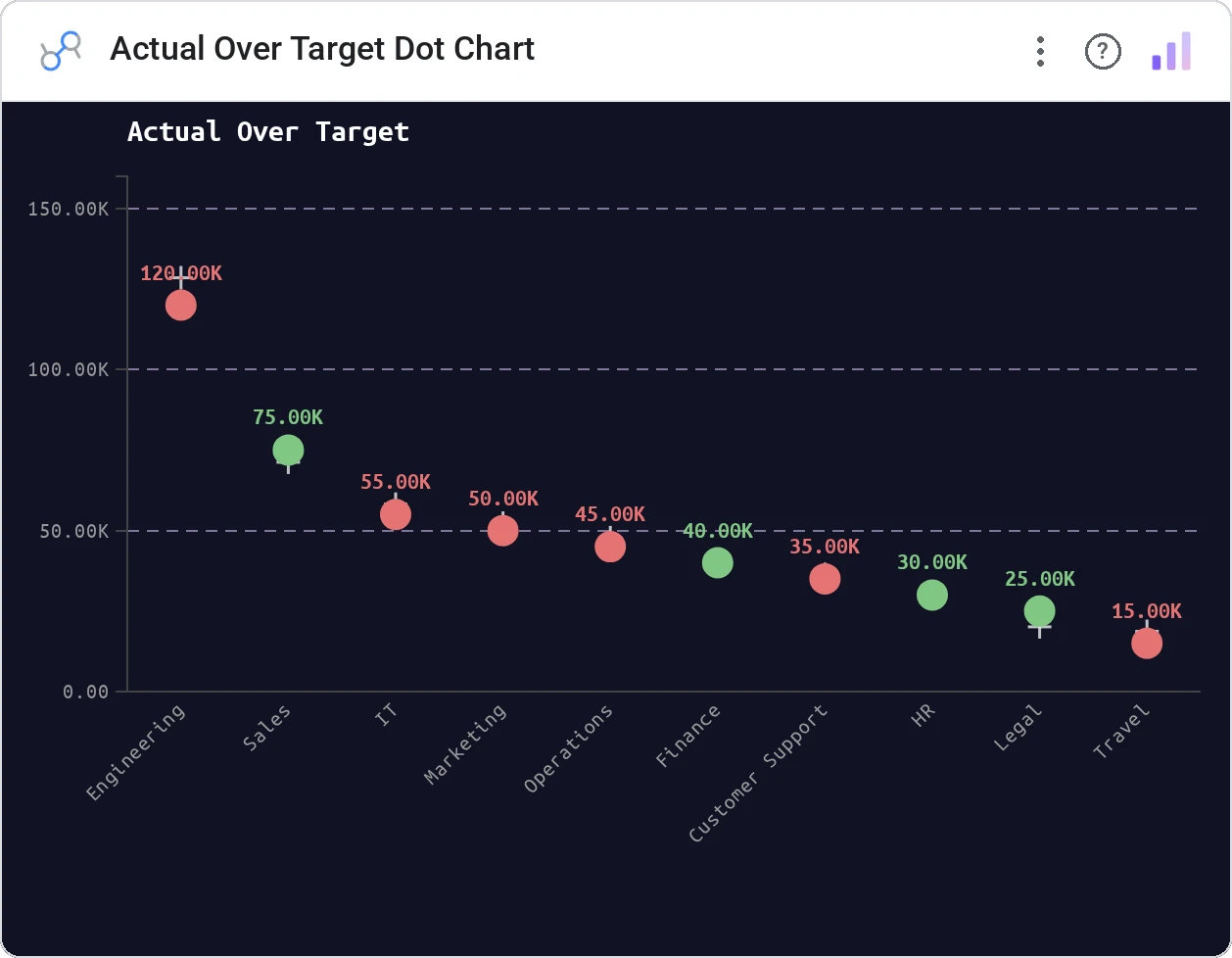
Actual Over Target Dot Chart plots actual values as colored dots against an optional target line. Beats are green, misses are red: earnings season in a single chart.
Dot markers for actuals positioned vs a target metric line, with beat / miss coloring and tooltip detail.
Designed for the specific shape of earnings, sales targets, and SLA reporting: actual vs target as a per-period verdict.
Three ways teams use it.
Quarterly EPS actual vs consensus.
Monthly bookings vs quota by team.
SLA per service vs threshold.
Add it in 30 seconds.
Open your Data Studio report and click Add a chart → Community visualizations → Explore more.
Paste the Viz Studio manifest URL or pick this chart from the Viz Studio gallery card.
Bind the dimensions and metrics in the data panel. Done.



Included in your vizstudio plan.
One plan, everything in it: the full library of 75+ charts. No per-seat upcharges, no metering. Build a real dashboard before you pay a cent.
Start free →