
Break-Even Chart
Fixed cost, variable cost, revenue, and the exact unit where they cross.
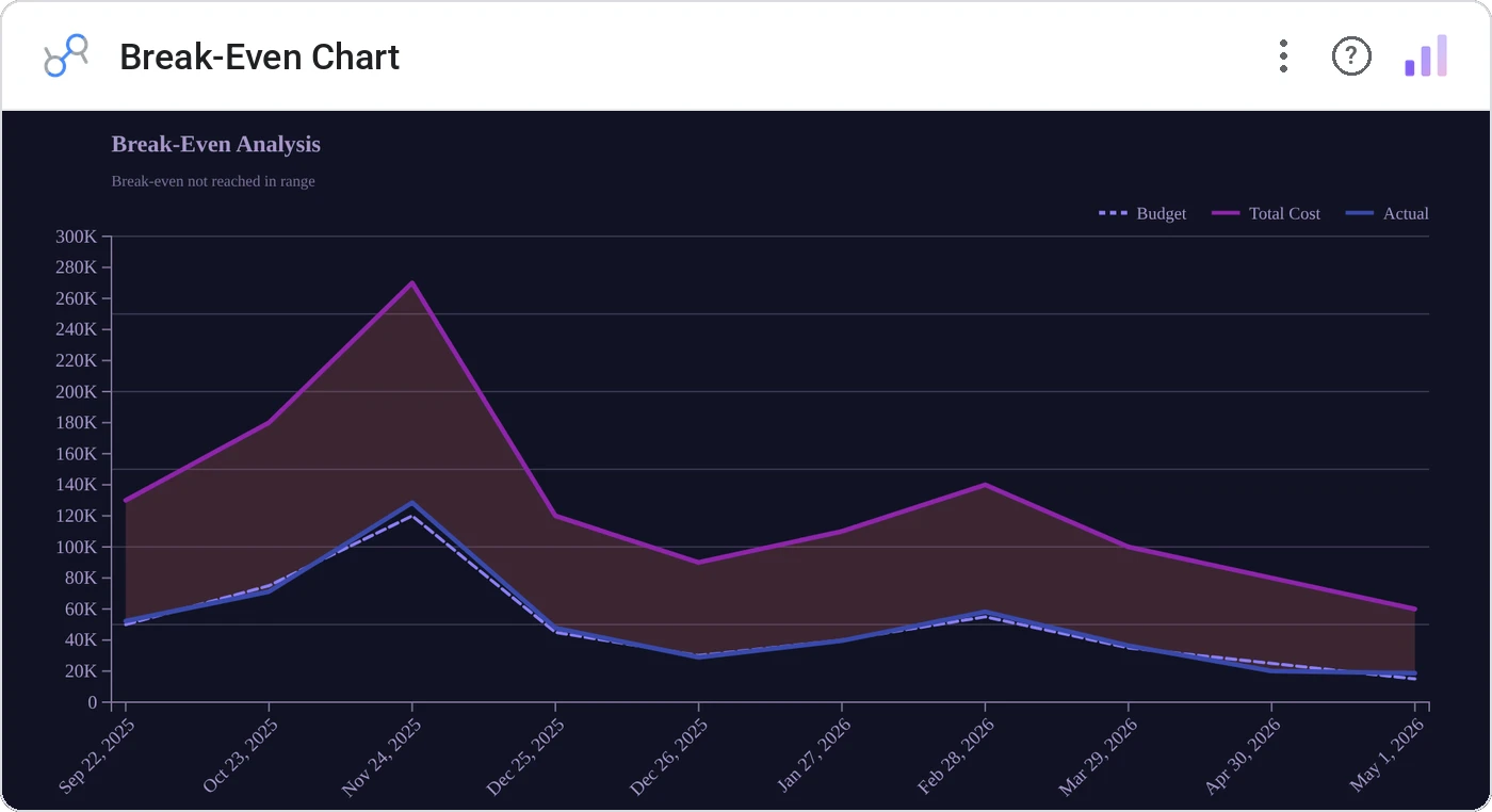
Break-Even Chart layers fixed cost, total cost, and revenue lines and annotates the crossover point with the break-even volume. It’s the chart every finance class teaches and every spreadsheet hides: finally first-class in your dashboard.
Plots fixed cost (horizontal), total cost, and revenue lines on shared axes; annotates the intersection with units and dollars.
Frees the break-even conversation from a static Excel cell. Live-update by tweaking inputs in your source.
Three ways teams use it.
Product launch break-even sensitivity.
Plant utilization vs. fixed overhead.
New tier launch: units to recoup engineering cost.
Add it in 30 seconds.
Open your Data Studio report and click Add a chart → Community visualizations → Explore more.
Paste the Viz Studio manifest URL or pick this chart from the Viz Studio gallery card.
Bind the dimensions and metrics in the data panel. Done.
More from Finance & Performance
All 75+ charts →
Included in your vizstudio plan.
One plan, everything in it: the full library of 75+ charts. No per-seat upcharges, no metering. Build a real dashboard before you pay a cent.
Start free →