
Big Calendar
Full calendar grid: event volume painted across every cell.
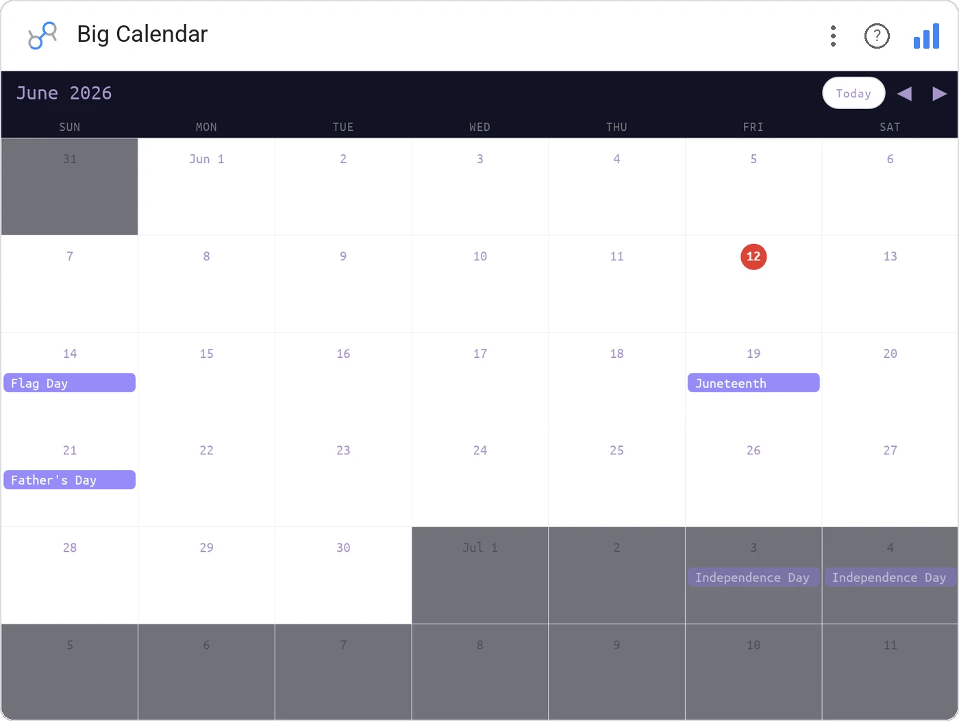
Big Calendar lays out a month or year as a heat-tinted grid, with each day colored by your metric. It’s the dashboard equivalent of leaving a wall calendar open: instantly readable, no axis required.
Renders a full calendar grid (month or year), tints each day cell by a metric, supports tooltips, and cross-filters to the rest of the page.
Time-of-week and time-of-year patterns jump out, the Tuesday slump, the Black Friday spike, the December lull.
Three ways teams use it.
Daily revenue colored across the year, holidays obvious.
Incident count per day in a year-at-a-glance heat layout.
PTO calendar with team coverage at a glance.
Add it in 30 seconds.
Open your Data Studio report and click Add a chart → Community visualizations → Explore more.
Paste the Viz Studio manifest URL or pick this chart from the Viz Studio gallery card.
Bind the dimensions and metrics in the data panel. Done.
More from Tables, Calendars & Combo
All 75+ charts →
Compact monthly calendar: one cell, one number, instant pattern.
Day-of-week × hour heatmap: when your audience actually shows up.

Row over row: DoD / MoM / YoY comparison table with deltas and % change.

Row × column matrix: normalize how you want, color tells the story.
Included in your vizstudio plan.
One plan, everything in it: the full library of 75+ charts. No per-seat upcharges, no metering. Build a real dashboard before you pay a cent.
Start free →