
Conversion Heatmap
Day-of-week × hour heatmap: when your audience actually shows up.
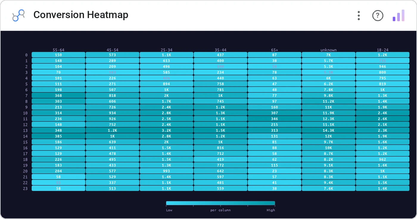
Conversion Heatmap maps a metric across a 7-day × 24-hour grid, surfacing peaks and dead zones without a single date filter. The defining chart for content scheduling, support staffing, and ad timing.
7 × 24 grid of cells tinted by your metric (conversion %, count, revenue), with axis labels, tooltip, and cross-filter on click.
Aggregates time-of-day behavior so the patterns leap out: Tuesday at 2pm vs Saturday at 10am, instantly comparable.
Three ways teams use it.
Conversion rate by hour and weekday: schedule promos to peaks.
Ticket arrival pattern to staff the queue.
Click-through by send time across campaigns.
Add it in 30 seconds.
Open your Data Studio report and click Add a chart → Community visualizations → Explore more.
Paste the Viz Studio manifest URL or pick this chart from the Viz Studio gallery card.
Bind the dimensions and metrics in the data panel. Done.
More from Tables, Calendars & Combo
All 75+ charts →
Full calendar grid: event volume painted across every cell.
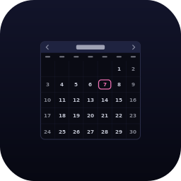
Compact monthly calendar: one cell, one number, instant pattern.

Row over row: DoD / MoM / YoY comparison table with deltas and % change.

Row × column matrix: normalize how you want, color tells the story.
Included in your vizstudio plan.
One plan, everything in it: the full library of 75+ charts. No per-seat upcharges, no metering. Build a real dashboard before you pay a cent.
Start free →