
Scatter Plot with Trendline
Scatter with a fitted trend line: correlation without the chart-junk.
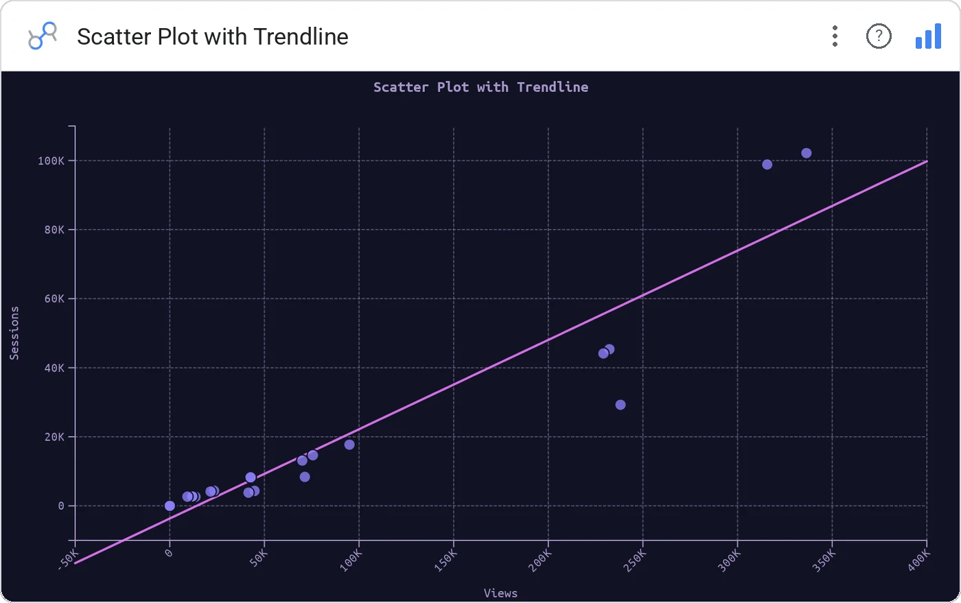
Scatter Plot with Trendline overlays a linear (or polynomial) trend on a standard scatter, with R² in the corner so analytical claims are calibrated.
x/y scatter with regression line, R² annotation, configurable curve order, tooltip, cross-filter, optional grouping color.
Correlations get over-claimed. R² + a visible trend keeps everyone honest.
Three ways teams use it.
Spend vs leads with fit and R².
Feature usage vs retention.
Volume vs cost per unit.
Add it in 30 seconds.
Open your Data Studio report and click Add a chart → Community visualizations → Explore more.
Paste the Viz Studio manifest URL or pick this chart from the Viz Studio gallery card.
Bind the dimensions and metrics in the data panel. Done.
More from Scatter, Correlation & Bubbles
All 75+ charts →
X × Y × size: three metrics, one chart, zero squinting.

A grid of bubbles: counts and magnitudes across two categorical axes.

Hexagonal density: scatter plots that survive 100k points.

Four-quadrant scatter, the strategy chart you've drawn on whiteboards.
Included in your vizstudio plan.
One plan, everything in it: the full library of 75+ charts. No per-seat upcharges, no metering. Build a real dashboard before you pay a cent.
Start free →