
Curved Columns (Animated + Zoom)
Animated curved columns: bars that arc to draw the eye.
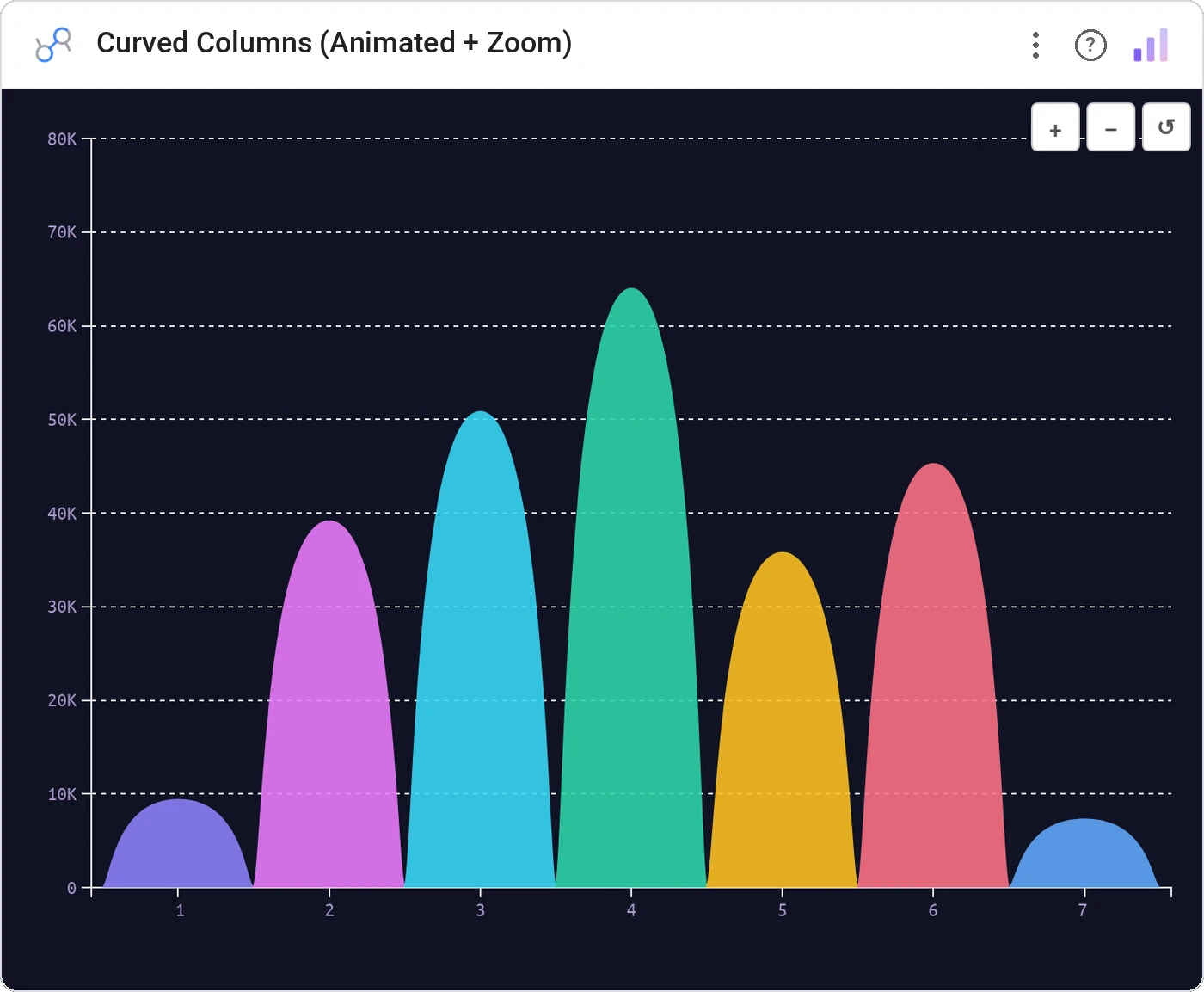
Curved Columns (Animated + Zoom) renders categorical bars as smooth arcs instead of straight verticals. Add animated entrance and zoom controls and you have a chart that’s presentation-ready out of the box.
Animated curved column bars with metric height, zoom controls, hover tooltip, and per-bar color.
Differentiates your charts visually in a sea of standard rectangles: useful for marketing dashboards and product launches.
Three ways teams use it.
Campaign performance bars at the top of a launch dashboard.
Press impressions per article in a quarterly recap.
New logos per quarter for a board deck.
Add it in 30 seconds.
Open your Data Studio report and click Add a chart → Community visualizations → Explore more.
Paste the Viz Studio manifest URL or pick this chart from the Viz Studio gallery card.
Bind the dimensions and metrics in the data panel. Done.
More from Bars, Columns & Ranking
All 75+ charts →
CI bars for A/B variants: significance baked in.

The animated bar chart race that wins every monthly review.

Curved columns, static, the still-frame version with the same elegance.

Two dots, one line: every gap between A and B made obvious.
Included in your vizstudio plan.
One plan, everything in it: the full library of 75+ charts. No per-seat upcharges, no metering. Build a real dashboard before you pay a cent.
Start free →