
Breakdown Chart
Donut + progress bars for category breakdowns, the dominant slice highlighted automatically.
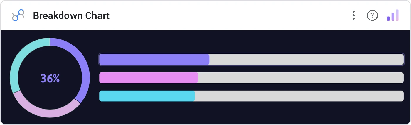
Breakdown Chart pairs a composite donut with horizontal progress bars so every category reads two ways: as a slice of the whole and as a value-vs-max bar. The dominant category gets an accent color so the headline lands in half a second.
Renders a center donut with category arcs, plus a stacked row of horizontal progress bars. Auto-detects the largest category and highlights it.
Two encodings (angle and length) for the same data lets the viewer pick whichever they read fastest. The auto-accent kills the "so what?" question.
Three ways teams use it.
Analyst rating distribution: Buy / Hold / Sell with the dominant call highlighted.
Top-2-box satisfaction broken down by tier.
Feature usage share with the runaway leader colored.
Add it in 30 seconds.
Open your Data Studio report and click Add a chart → Community visualizations → Explore more.
Paste the Viz Studio manifest URL or pick this chart from the Viz Studio gallery card.
Bind the dimensions and metrics in the data panel. Done.
More from KPI, Status & Goals
All 75+ charts →
Stephen Few's gauge replacement: actual, target, and ranges in one bar.
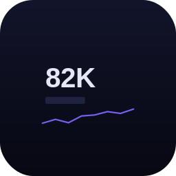
Headline numbers with trend lines baked in, the executive scorecard, refined.
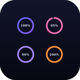
A row of donuts that each say "X% done": instantly readable.
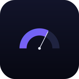
Half-circle gauge: same story, half the real estate.
Included in your vizstudio plan.
One plan, everything in it: the full library of 75+ charts. No per-seat upcharges, no metering. Build a real dashboard before you pay a cent.
Start free →