
Choropleth Map
Tile-grid map: every state or country, no projection pain.
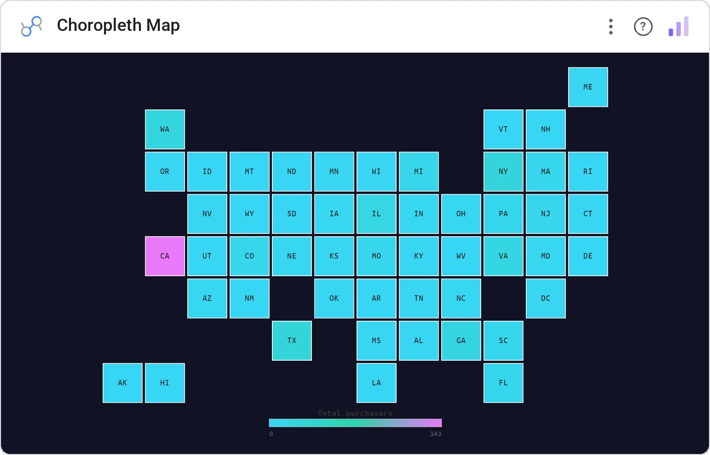
Choropleth Map ditches the wonky shapefile rendering and lays out US states or world countries as a tile grid. Sequential, diverging, or binned color scales; square, rounded, hex, or circular tiles. Click a tile to cross-filter the page.
Accepts state abbreviations/names or ISO-2/ISO-3 country codes. Sequential/diverging/binned color, tile shape options, legend positioning, tooltip metric, cross-filter on click.
Real-world map projections under-represent small dense states (hello, RI) and over-emphasize large empty ones. Tile grids give every entity equal voice.
Three ways teams use it.
Revenue by state with the top 5 tiles called out.
CPL by country across a global campaign.
Indicator by region without distorting Alaska.
Add it in 30 seconds.
Open your Data Studio report and click Add a chart → Community visualizations → Explore more.
Paste the Viz Studio manifest URL or pick this chart from the Viz Studio gallery card.
Bind the dimensions and metrics in the data panel. Done.

Included in your vizstudio plan.
One plan, everything in it: the full library of 75+ charts. No per-seat upcharges, no metering. Build a real dashboard before you pay a cent.
Start free →