
Variance Bar
Variance bars: actual minus baseline, signed and sorted.
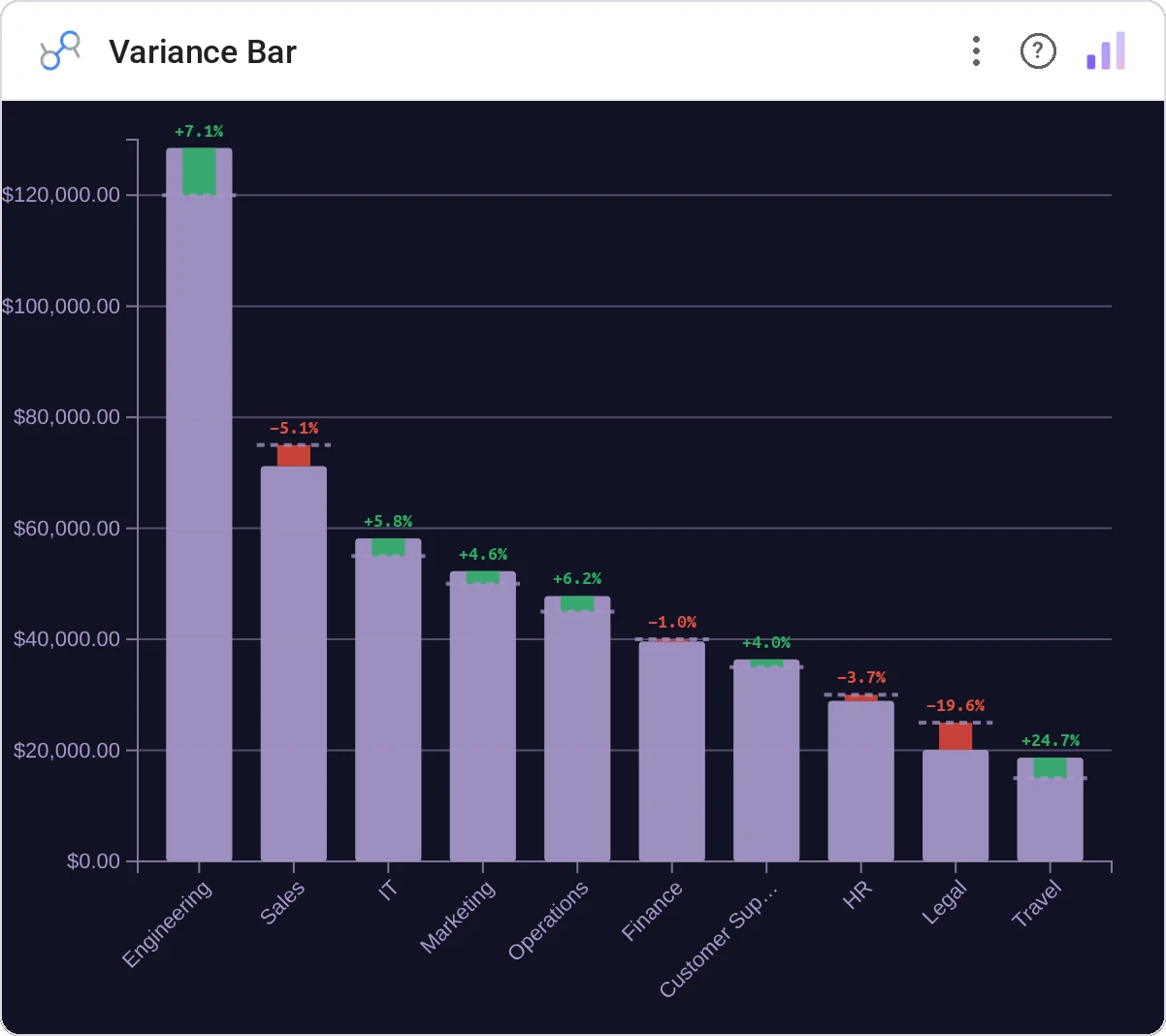
Variance Bar Chart subtracts a baseline from each category’s actual and draws the signed difference. Sorted by magnitude or direction, the chart tells the story before you read the labels.
Signed horizontal or vertical bars showing actual-minus-baseline per category, optional sorting, theme-aware colors.
Tables of plan vs actual hide the story; variance bars surface it.
Three ways teams use it.
Actual vs budget per cost center.
Actual vs forecast per region.
Spec vs measured per unit.
Add it in 30 seconds.
Open your Data Studio report and click Add a chart → Community visualizations → Explore more.
Paste the Viz Studio manifest URL or pick this chart from the Viz Studio gallery card.
Bind the dimensions and metrics in the data panel. Done.
More from Bars, Columns & Ranking
All 75+ charts →
CI bars for A/B variants: significance baked in.

The animated bar chart race that wins every monthly review.

Animated curved columns: bars that arc to draw the eye.

Curved columns, static, the still-frame version with the same elegance.
Included in your vizstudio plan.
One plan, everything in it: the full library of 75+ charts. No per-seat upcharges, no metering. Build a real dashboard before you pay a cent.
Start free →