
Pyramid Area Chart
Categorical magnitude as overlapping pyramids: distinctive and on-brand.
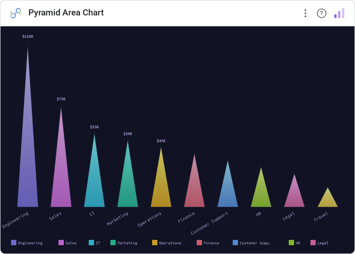
Pyramid Area Chart renders categories as overlapping pyramid silhouettes along a baseline. Magnitude is encoded by height and width, the look of an architectural section drawing, the function of a bar chart.
Overlapping pyramid silhouettes per category sized by metric, with theme-aware colors and labels.
When a bar chart needs to feel editorial (annual reports, brand storytelling, hero slots), this is the version.
Three ways teams use it.
Annual report headline charts.
Brand campaign performance hero.
Press impressions per outlet.
Add it in 30 seconds.
Open your Data Studio report and click Add a chart → Community visualizations → Explore more.
Paste the Viz Studio manifest URL or pick this chart from the Viz Studio gallery card.
Bind the dimensions and metrics in the data panel. Done.
More from Bars, Columns & Ranking
All 75+ charts →
CI bars for A/B variants: significance baked in.

The animated bar chart race that wins every monthly review.

Animated curved columns: bars that arc to draw the eye.

Curved columns, static, the still-frame version with the same elegance.
Included in your vizstudio plan.
One plan, everything in it: the full library of 75+ charts. No per-seat upcharges, no metering. Build a real dashboard before you pay a cent.
Start free →