
Bump Chart
Rank-over-time line chart: who's climbing, who's sliding.
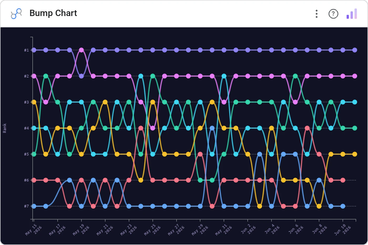
Bump Chart connects each category’s rank at every time step with a colored line. The eye follows the line: overtakes, slides, and surprises all read instantly. The animated cousin of a bar race, but every period on screen at once.
Plots category rank over time as smooth lines, with consistent per-category color, tooltips, and optional value labels at endpoints.
Lines that cross are inherently storyable. Better than a stacked area when the categorical order matters.
Three ways teams use it.
Channel rank by attributed revenue across 12 months.
Conference standings week by week.
Top 8 features by daily users over a quarter.
Add it in 30 seconds.
Open your Data Studio report and click Add a chart → Community visualizations → Explore more.
Paste the Viz Studio manifest URL or pick this chart from the Viz Studio gallery card.
Bind the dimensions and metrics in the data panel. Done.
More from Time Series & Trends
All 75+ charts →
Two metrics, two scales, one line of sight: without the lie factor.
Stacked area over time: composition and trend on the same canvas.

Same signed stacked bar, animated entrance + zoom controls.

Stacked bars with negative values: wins above, losses below, total preserved.
Included in your vizstudio plan.
One plan, everything in it: the full library of 75+ charts. No per-seat upcharges, no metering. Build a real dashboard before you pay a cent.
Start free →