
Dual Axis Chart
Two metrics, two scales, one line of sight: without the lie factor.
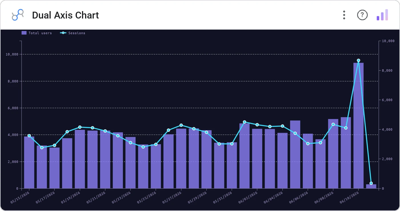
Dual Axis pairs two metrics on independent y-axes: bars for volume, line for rate, or any combination. Carefully designed scales and ticks keep the chart honest while staying readable.
Bar + line, or two lines, with independent scaled y-axes, shared x-axis, legend, tooltip, and cross-filter.
Volume and rate often need the same chart and never the same scale. Dual axis solves that without forcing a second visualization.
Three ways teams use it.
Spend (bars) and CPL (line) over time.
Sessions (bars) and conversion % (line).
Pipeline volume (bars) and win rate % (line).
Add it in 30 seconds.
Open your Data Studio report and click Add a chart → Community visualizations → Explore more.
Paste the Viz Studio manifest URL or pick this chart from the Viz Studio gallery card.
Bind the dimensions and metrics in the data panel. Done.
More from Time Series & Trends
All 75+ charts →
Rank-over-time line chart: who's climbing, who's sliding.
Stacked area over time: composition and trend on the same canvas.

Same signed stacked bar, animated entrance + zoom controls.

Stacked bars with negative values: wins above, losses below, total preserved.
Included in your vizstudio plan.
One plan, everything in it: the full library of 75+ charts. No per-seat upcharges, no metering. Build a real dashboard before you pay a cent.
Start free →